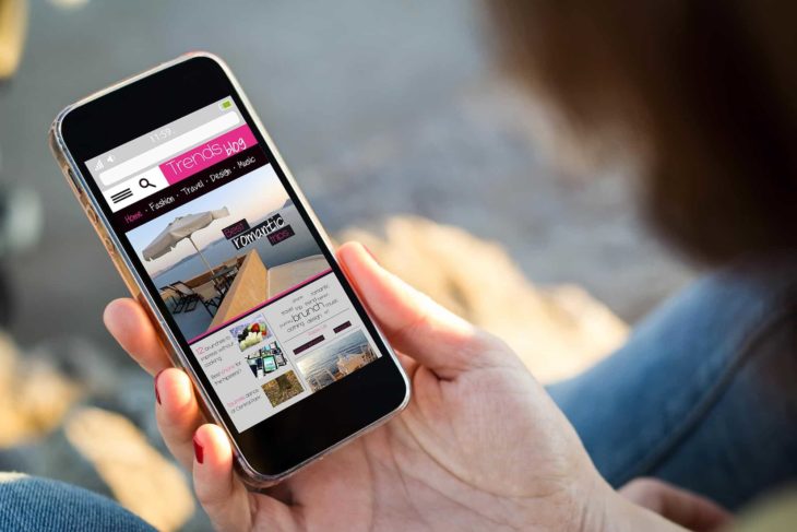
Companies are beginning to notice the rise in web viewing on mobile. Everyone is on their phones, browsing websites on the go. Far away are the days where your mobile UX (or mobile user experience) was on the backburner. Businesses and web designers are optimizing mobile UX to give their target audience an interactive and enjoyable website while they browse on their phones.
Don’t know where to start for this user experience? Find out how mobile UX design tools allow you to build your brand’s story in a way that’s easy to consume for your customers.
3 Tips for Optimizing Mobile UX
With all the modern technology our phones hold in the palm of our hands, web designers and businesses are drawing more importance to how their audience interacts with their website on mobile. If you’re about to venture into the world of web design for phone use, optimizing mobile UX is crucial for engaging an audience while they browse your page on their lunch breaks.
Follow the mobile UX design principles
Mobile user experience design comes down to these nine principles:
- Cut out the clutter
- Mobile navigation must be cohesive
- Make a seamless experience across multiple platforms
- Design finger-friendly targets
- Create legible text
- Construct clear visible interface elements
- Base controls off of hand positions
- Keep the need for typing to a minimum with auto-complete
- Test out your design
Following these principles, your mobile user experience is bound to be intriguing.
Keep internet speed in mind
While you want to have a quality mobile site, often there are components of your website which take time to load on certain Internet speeds. Loading time is one way to lose your audience, as they will grow frustrated waiting around for a large image to load. Low speed can keep them from getting the information they need, and risk them leaving to visit another site.
It comes down to the following components for progressive web apps or mobile sites:
- Faster loading time with slower Internet speed
- Offline viewing of content
- Additional functionality
- Push notifications
- Add the site to their home screen
Simplify your mobile site and test it on various types of Internet speeds so you are aware of any technical glitches it could have while a user is browsing it.
Be mindful of software updates
“I love when my phone does a software update,” said no one ever. Getting the latest version of a mobile phone’s hardware often causes troubles in the functionality of the mobile UX. Upgrades in the phone system often slow download times and make the user experience downgrade. Similar to Internet speeds, test out the site on different types of systems to ensure optimization of your website for various phone software.
Still Want a Stellar Website for Desktop?
Mvestor Media are the WordPress design pros and will build you a functional and interactive website for desktop. Why WordPress? We believe that we’d rather be exceptional at a few things rather than “okay” at a lot things. Connect with us today!

